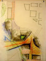
In this scheme I began looking at how the site can respond to the larger city context and connect to the planned OHSU campus across the river and identify this district as a place of learning. My response was to open up to the OHSU campus with an opening and viewing platform. Some other programatic issues that I wanted to resolve were moving the parking structure to the east Opera House property and doing a land swap the future opera house so that it is adjacent to the river. The reviewer response to these plans was that I need to pay close attention to the plazas designs and its edges. Also there are too many plazas and for the campus to be successful it has to have a heart. In this scheme the plazas art like vast corridors. Which I agree. I think my next challenge is to build upon this scheme to increase the density of development that still allows for light and reinforces the edges of ONE main plaza, and have pedestrian corridors web out from it.
Material Studies
In terms of the Micro scale I'd like to investigate more with the rice paper and color. I'd like to see these things in a series of panels that could really animate a space with color and textured light. I'm imagining these screens would be ideal for meeting rooms or casual meeting spaces along corridors. Because my current method is so low-tech, I'm sure I can find precedents if I looked. Also I think there is an opportunity to make it engaging to the users. For example, they could control the diffusion of the panel with the salt crystals.
My name is Kent Wu. This blog will be documentation of my trials and revelations for my yearlong Thesis Project to complete my Bachelor of Architecture at the University of Oregon. It'll possibly include other observations that are come to me during this process. Please feel free to comment.
Sunday, January 23, 2011
Sunday, January 9, 2011
Urban Spaces
Urban Spaces by Jacobo Krauel, has a lot of glamor pictures of new urban spaces and designs through out the world. The case studies show a range from Plazas to art installations. It seems like the trend is that new urban spaces are taking a stance to engage the public and raise the public's conscientious of its existence. For example, Torico Square
Urban Space by Rob Krier, I a more architectural theory of historic spaces. It explores aspects that are not just perceived in plan but sectional as well. There are a lot of diagrams that explain variations of urban spaces.
Both of these books will be on my desk until Jan 30th. and back in the Library after that. Borrow them at any time just put them back of course.
Week 1 (or should i say 12)
The one hour charrette was productive. I wish it was longer. I cam up with an idea and further constraints, However, it was was difficult to generate ideas apart from the Charrette, until this weekend. So I'd like to push it further and explore other urban scale possibilities before I narrow a specific location on the OMSI site. Once I've done that then I'll test which one is contributing to the the core values of creating a learning/ destination community, its ability to adapt to the future realities, and its connection to the Willamette and natural processes.
I also dig the schedule setup.
I also dig the schedule setup.
Subscribe to:
Comments (Atom)


