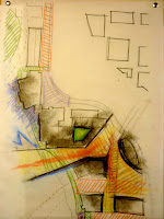
In this scheme I began looking at how the site can respond to the larger city context and connect to the planned OHSU campus across the river and identify this district as a place of learning. My response was to open up to the OHSU campus with an opening and viewing platform. Some other programatic issues that I wanted to resolve were moving the parking structure to the east Opera House property and doing a land swap the future opera house so that it is adjacent to the river. The reviewer response to these plans was that I need to pay close attention to the plazas designs and its edges. Also there are too many plazas and for the campus to be successful it has to have a heart. In this scheme the plazas art like vast corridors. Which I agree. I think my next challenge is to build upon this scheme to increase the density of development that still allows for light and reinforces the edges of ONE main plaza, and have pedestrian corridors web out from it.
Material Studies
In terms of the Micro scale I'd like to investigate more with the rice paper and color. I'd like to see these things in a series of panels that could really animate a space with color and textured light. I'm imagining these screens would be ideal for meeting rooms or casual meeting spaces along corridors. Because my current method is so low-tech, I'm sure I can find precedents if I looked. Also I think there is an opportunity to make it engaging to the users. For example, they could control the diffusion of the panel with the salt crystals.


No comments:
Post a Comment